

Updated on: 2026-06-02
Asymmetrical vase design creates visual tension that makes a room feel more curated and less repetitive. The key is balancing height, negative space, and surface color so the vase supports the rest of your decor. Choosing the right scale helps the piece look intentional, whether you place it on a shelf, side table, or entry console. With the right styling technique, an asymmetrical silhouette can work in both modern and classic interiors.
Common Mistakes to Avoid
Pros & Cons Analysis
Quick Tips
Wrap-Up & Key Insights
Q&A Section
About the Author Section
Asymmetrical vase design has become a reliable way to introduce character into a room. Unlike perfectly balanced shapes, an asymmetrical form creates a deliberate focal point that guides the eye. In this guide, you will learn how to evaluate proportion, color, and placement so your vase looks designed rather than accidental. You will also find practical styling methods you can reuse for fresh seasonal arrangements without starting from scratch.
Common Mistakes to Avoid
One common mistake is choosing a vase that is too small for the surface. Small decorative pieces can disappear when placed on wide consoles or dining sideboards. When the silhouette vanishes, the intended asymmetry loses its impact. Measure the space first, then select a vase that visually anchors the area.
Another mistake is ignoring the direction of visual weight. Asymmetrical vase design often relies on one side reading heavier due to shape, opening angle, or curvature. If the vase is turned incorrectly, the design can look lopsided rather than intentional. Treat orientation as part of the design, not as an afterthought.
Overcrowding is also frequent. Many arrangements add too many stems, too many colors, or too much texture. When everything competes, the vase shape is no longer the hero. A strong asymmetrical silhouette benefits from restraint, especially around the neck and rim where the eye first lands.
Color mismatch can undermine the effect. A vase may have a striking profile, yet the palette may conflict with nearby surfaces. If your room includes bold artwork, dark wall paint, or patterned textiles, the vase must either echo a tone or intentionally soften the scene. Otherwise, the contrast becomes chaotic.
Finally, people often skip spacing and negative space. Asymmetry depends on breathing room. If the vase is placed too close to clutter, shelves, or tall frames, the lines merge and the visual rhythm breaks. Give the vase a clear zone so it can read as a structured element.

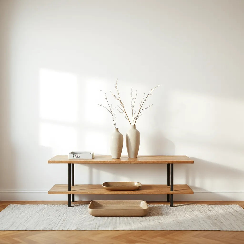
Balanced negative space with angled visual weight lines
Pros & Cons Analysis
Pros
Creates a clear focal point through intentional imbalance, which adds depth to minimalist rooms.
Works well with modern and transitional decor because it signals design direction without being loud.
Improves visual flow in the home. The eye naturally follows the contour and can connect other elements such as art, lighting, and textiles.
Offers flexible styling. You can keep stems minimal for a refined look, or add more volume while still maintaining structure.
Cons
Requires careful orientation. If placed at the wrong angle, the asymmetry can appear unbalanced.
Needs thoughtful scale. Too small or too tall can make the design feel awkward rather than artistic.
Can be harder to style with busy patterns. If the surrounding decor is already dense, the vase may not stand out.
May demand more attention during seasonal refreshes. Small changes in stem height or color can shift the overall harmony.
Even with these limitations, the benefits are strong when you approach styling as composition. Asymmetry is not random. It is a controlled design choice that becomes rewarding when you align it with your space.
How it supports different interior styles
In contemporary settings, an asymmetrical vase design often complements clean lines and neutral palettes. The shape provides interest without relying on ornament. In classic spaces, the same concept can still work, especially when you keep the materials refined and choose stems with graceful movement. For Scandinavian-inspired rooms, asymmetry pairs well with light wood tones because it adds structure while the room remains calm.
A practical product integration
If you want a direct starting point for styling, consider the Kabin Vase. Its form makes a strong statement, and it can anchor an arrangement without needing elaborate florals.
Kabin Vase

Place it where you can see the contour clearly, such as an entry console or a shelf that has adequate space around it. Then style with stems that match the mood of your room.
Quick Tips
Use these short methods to apply asymmetrical vase design principles quickly and consistently.
Measure the surface and target a vase that occupies a meaningful portion of the width. Aim for a size that visually anchors, not a size that disappears.
Choose a dominant side. Identify which side of the vase reads heavier and place it so that the visual weight supports your composition.
Limit to one or two stem types. A clean structure reads better than mixed clutter, especially for asymmetrical forms.
Use height variation. Combine one taller stem with shorter stems to echo the vase silhouette.
Leave negative space around the rim. The opening area is the focal zone, so avoid crowding near the top.
Select a palette that either matches one existing color or contrasts softly. Neutral backgrounds support contrast, while bold rooms benefit from tone alignment.
Consider the viewing angle. Asymmetrical pieces are not fully understood from every angle. Test placement by stepping back and checking sightlines.
Use a tray or base for stability. A subtle base can help the vase look intentional and reduce the visual impression of floating clutter.
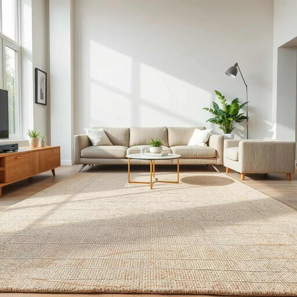
For a cohesive living area, align your vase styling with your broader design choices. If your space includes statement seating, you can balance the composition by keeping the vase palette calmer. For example, you can review seating options such as the Izumi chair or a coffee table anchor like Honin coffee table to guide your color and proportion decisions.
Asymmetry becomes especially effective when other elements offer their own structure. A well-proportioned cabinet can provide a backdrop, and a vase can add the finishing linework. If you plan to build a layered vignette, consider storage pieces such as Asuka cabinet to support the overall composition.

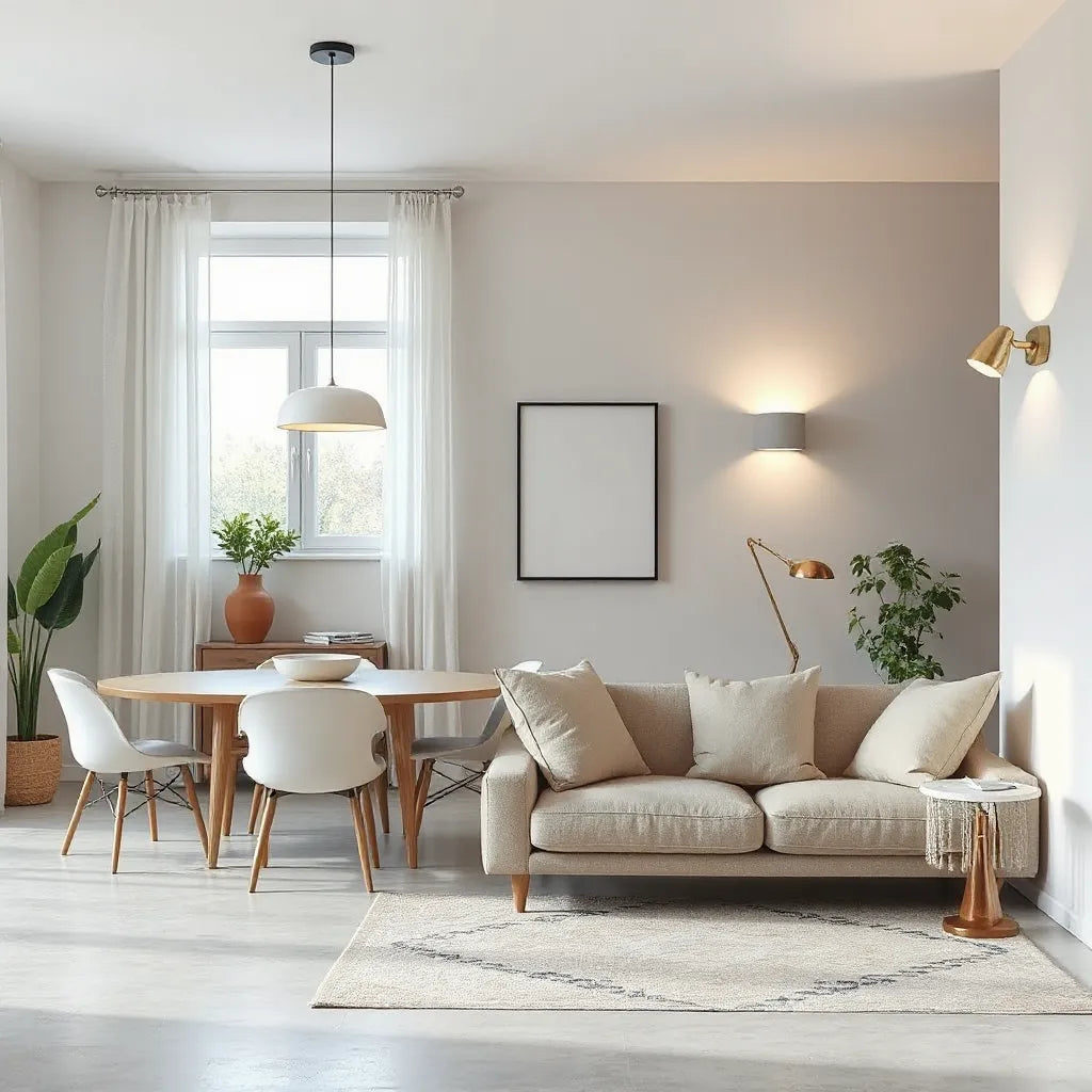
Vase contour paired with controlled stem height gradients
When styling with natural materials, focus on form rather than quantity. Tall, simple stems emphasize the silhouette, while clustered low stems add softness. The goal is not to overpower the vase, but to express the asymmetrical lines with confidence.
Wrap-Up & Key Insights
Asymmetrical vase design is a powerful tool for creating a focal point that feels intentional and modern. The most important decisions involve scale, orientation, color harmony, and negative space. When you avoid overcrowding and preserve a clear viewing angle, the vase reads as a designed element rather than a decorative afterthought.
To apply these principles today, select a placement with good sightlines, choose a restrained stem composition, and adjust stem height until the arrangement mirrors the vase contour. If you want to explore a strong silhouette to start with, visit the Kabin Vase product page and build your arrangement around its shape.
Q&A Section
How do I choose the right size for asymmetrical vases?
Choose a size based on the width of the surface and the typical viewing distance. A vase should visually anchor the area, which usually means it occupies a meaningful portion of the available width. If the vase is shorter than the objects around it, add stem height or place it on a more suitable surface rather than forcing the scale to match.
What type of flowers or stems work best with asymmetrical vase design?
Stems that follow a clear vertical rhythm work best, such as tall single stems, light branching, or grasses with gentle movement. Keep the arrangement simple and avoid dense clusters near the rim. If you want more volume, add it lower in the arrangement so the top still respects negative space.
Should I match the vase color with my room, or contrast it?
Either approach can work, but the room determines the outcome. If your decor uses calm neutrals, contrast can create a bold focal point. If your decor is already vivid, a tone match is usually safer. Use color echoes, such as repeating one accent shade found in textiles, art, or wood finishes.
How can I prevent my arrangement from looking unbalanced?
Start by identifying the dominant side of the vase. Then build the arrangement so that stem volume and height support that side, while the other side provides lighter visual counterbalance. Step back frequently to check the silhouette from your main viewing angle, and adjust by trimming stems rather than adding more material.
About the Author Section
Nisu Home
Nisu Home is a design-focused team that supports thoughtful styling through practical interior guidance. The expertise behind these recommendations centers on proportion, material harmony, and the art of building cohesive vignettes. For readers who value calm, intentional design, you can use this approach to make every decorative detail feel purposeful. Thank you for reading, and may your next home update look unmistakably refined.
Disclaimer: This article is for general informational purposes only and does not provide professional design, installation, or purchasing advice tailored to your specific situation. Results may vary based on your room layout, lighting conditions, and personal preferences.

Leave a comment
This site is protected by hCaptcha and the hCaptcha Privacy Policy and Terms of Service apply.