

Updated on: 2026-07-16
Wood-toned vases bring warmth to modern interiors while staying visually grounded. They pair well with fresh flowers, dried stems, or minimalist styling that does not rely on heavy ornamentation. When you choose the right shade, finish, and shape, the vase becomes a design anchor rather than a decoration that needs constant replacement. This guide explains how to select, style, and care for wood-inspired ceramic or composite vases so your space looks intentional all year.
1. What Wood-Toned Vases Are
Wood-toned vases are decorative containers designed to look like wood, using finishes that mimic the warmth of timber. In most cases, they are ceramic, resin, or other engineered materials with a color treatment and surface texture that evokes natural grain. The main design goal is consistency: you can achieve a wood-like aesthetic without worrying about the unevenness, cracking risk, or seasonal movement that occurs with real wood.
These vases work across styles. They look natural in Scandinavian-inspired rooms, add balance to industrial spaces, and soften the edges of minimalist interiors. Even when you only display a few stems, the wood-inspired tone helps your arrangement read as curated rather than accidental.
In this article, you will learn how to select the right shade and silhouette, how to style the vase for both fresh and dried arrangements, and how to keep the finish looking clean.
2. Why the Tone and Grain Feel Matter
Not all wood tones are equal. A vase can appear light and airy, or it can feel deep and grounded. Selecting the correct shade is the easiest way to make your decor look cohesive.
Consider these visual signals:
- Undertone: Some finishes lean warm (honey, oak, caramel). Others lean neutral (beige, ash). Choose based on your existing palette.
- Perceived grain: You may see subtle striations, matte texture, or a smooth wood-effect finish. Grain style affects how busy the vase looks from a distance.
- Contrast: If your space is very light, a medium or darker wood tone creates focus. If your space already has heavy contrast, a lighter vase can prevent visual overload.
When you match undertone and contrast, the vase feels integrated. When you mismatch them, the decor can look like it was added after the room was finished.

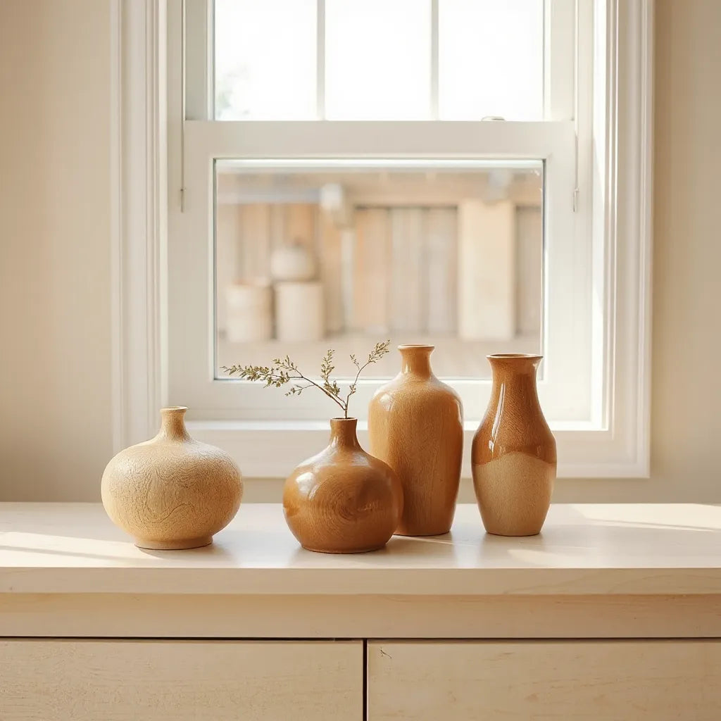
Warm wood hues, subtle grain textures, and soft lighting
3. Key Advantages of Wood-Toned Vases
Wood-toned vases offer a blend of visual warmth and styling flexibility. Below are the practical advantages that matter most for everyday home decor.
- Instant warmth in any room: The wood-inspired color reads as natural and inviting, even when you use a minimalist arrangement.
- Works with multiple planting types: Use fresh flowers, dried botanicals, or sculptural branches. The vase adapts to changing seasons.
- Stable appearance over time: Many wood-effect finishes are designed to resist everyday scuffs and color fading better than untreated natural materials.
- Design balance: The tone creates harmony between hard surfaces (tables, shelves, metal lighting) and softer elements (textiles, rugs).
- Easy to style without overthinking: Shapes and finishes typically look intentional with simple stems. You do not need elaborate floristry to achieve a polished effect.
If you are building a cohesive interior, the vase can act as a “bridge” between your furniture finishes and your decorative accents.
4. How to Choose Shape and Size for Your Space
Shape is where wood-toned vases become truly effective. The right silhouette supports the arrangement and influences how tall and balanced the display feels.
Start by evaluating the surface and sightline.
- Countertops and sideboards: Choose medium heights and stable bases. Narrow necks suit single stems or small bouquets. Wider mouths suit fuller arrangements and dried sprays.
- Dining tables: Select a vase that supports the center of the table without obstructing conversation. If the arrangement is tall, balance it with a low visual spread.
- Shelves and console tables: Opt for vertical shapes that prevent clutter. Slim profiles can complement books and framed art without competing for attention.
- Floor areas near seating: Consider taller forms with a strong base. They can anchor a corner and reduce the empty feeling of open space.
To choose the correct scale, consider two rules. First, the vase should not dominate the room. Second, it should not look too small once the stems are added. If you are uncertain, select the middle option and keep stems proportional to the vase height.
5. Material and Finish: What to Look For
Wood-inspired decor can be produced with different materials. Understanding finish quality helps you pick a vase that looks better and lasts longer.
Finish type
- Matte finishes: Matte wood effects look calm and hide minor surface imperfections. They suit quiet interiors and neutral palettes.
- Satin or lightly glossy finishes: A soft sheen can increase depth, especially in rooms with natural light. It also makes the vase easier to wipe clean.
- Textured finishes: Some wood-effect styles include grain-like ridges. These offer visual interest but may require gentler cleaning to avoid trapping dust.
Construction details
Look for balanced weight and a stable base. If a vase wobbles on a flat surface, it will feel harder to style. Also check the opening. A narrower opening can control stem shape, while a wider opening supports multiple botanicals.
When you want a decorative centerpiece that still feels refined, a wood-toned vase with a stable silhouette and consistent finish is usually the safest choice. You avoid the “decorative clutter” problem that happens when shapes are overly elaborate.
6. Styling Ideas That Look Professional
Styling wood-toned vases is about restraint and proportion. The goal is to create a clear visual hierarchy: vase shape first, stems second, and color accents last.
Fresh stems: make them feel intentional
For fresh flowers, choose a limited palette. One warm tone and one contrast tone usually looks best. For example, combine soft cream blooms with a muted green foliage base. Keep the stem arrangement aligned with the vase neck so the silhouette stays clean.
Dried botanicals: emphasize texture
Dried arrangements look especially natural in wood-inspired vessels. Use varied textures such as airy grasses, thin branches, and fuller blooms. Keep color muted: beige, tan, and warm browns harmonize with the vase tone. Avoid overly saturated colors unless your room already contains matching accents.
Minimal styling: one stem, strong lines
If you prefer minimal decor, use one strong stem and let the negative space do the work. A single branch can look more designer than a crowded bouquet, particularly in modern spaces with clean lines.
When you want a practical starting point, you can also create a consistent “vase system” across rooms: same finish family, different sizes. This approach makes the home feel styled rather than piece-by-piece.
Here is a single-product example you can use as a reference for silhouette and tone:
Kabin Vase

Shop Kabin Vase

Single stem silhouette, muted palette, and balanced negative space
Pairing with other materials
Wood tones are versatile because they connect with many common materials. Consider these pairing outcomes:
- Stone surfaces: Warm wood next to marble or travertine creates contrast without friction.
- Textiles: Wood-toned vases pair well with woven fabrics and neutral upholstery, adding a natural softness.
- Metal accents: Brushed brass or matte black hardware adds structure. Choose foliage and stems that do not clash with the metal’s undertone.
If you also use bar seating or dining chairs, maintain a consistent warmth across finishes. A room can handle differences in color, but it performs best when undertones align.
If you are shaping a cohesive dining area, you may find it useful to review seating options from Haruto bar seating as a reference point for how wood-inspired warmth can complement modern forms.
7. Care and Maintenance for Lasting Beauty
Proper care preserves the look of wood-toned vases and supports long-term styling. The core principle is gentle cleaning and careful handling.
Routine cleaning
- Dust regularly: Use a soft microfiber cloth or a dry duster to remove surface dust.
- Wipe with mild soap: For smudges, use a damp cloth with a small amount of gentle dish soap. Avoid harsh cleaners that may affect the finish.
- Dry thoroughly: Wipe dry after cleaning to prevent residue buildup.
Fresh water use
If you fill the vase with water for fresh stems, keep maintenance consistent. Replace water regularly and rinse the interior. Stains can form if water and plant matter remain for extended periods.
To reduce residue, consider placing a flower-safe insert or using a clean container style approach if the vase opening is sensitive. The aim is to keep the wood-effect finish from absorbing water-related buildup.
Dried arrangements
Dried botanicals need less water handling, but they can collect dust. Use a soft brush to remove debris from textured areas. When needed, refresh the look by replacing stems rather than forcing heavy cleaning that may disturb the finish.
Handling and placement
- Use coasters for surfaces: Place the vase on a stable base and avoid direct contact with rough tabletops.
- Prevent knocks: Keep the vase away from high-traffic edges where it can be bumped.
- Mind temperature changes: Avoid placing the vase near heat sources that can alter surface appearance over time.
8. Quick Tips for Better Results
- Match the vase undertone to your main wood or flooring color family.
- Choose a silhouette that supports your stems: narrow necks for single stems, wider openings for fuller looks.
- Keep your palette limited to avoid visual noise, especially with dried arrangements.
- Use negative space. A minimal arrangement often looks more premium than a crowded one.
- Clean gently. Avoid abrasive pads that can dull matte finishes.
- Refresh stems as needed instead of over-cleaning the vase surface.
- When styling multiple areas, keep the same finish family for consistency.
9. Summary & Next Steps
Wood-toned vases create warmth, structure, and visual cohesion across many interior styles. You achieve a professional result by choosing the right shade undertone, selecting a shape that matches the arrangement type, and styling with restraint. Consistent care, gentle cleaning, and thoughtful placement protect the finish and extend the vase’s usefulness.
Next, decide where you want the focal point: a sideboard, entryway console, dining table center, or shelf. Then choose a size that balances negative space and stem proportion. If you want an easy way to start, select one wood-inspired silhouette and build around it with muted floral tones and complementary textures.
10. Q&A Section
How do I choose the right wood tone for my room?
Start with the dominant warm surfaces in your home, such as flooring, cabinetry, or large wood furniture. If those elements look honey or caramel, choose a similar warm undertone. If your space feels neutral or light, select an ash or beige-leaning wood effect. The goal is to keep undertones aligned so the vase appears integrated.
Are wood-toned vases better for fresh flowers or dried stems?
They work for both. Fresh flowers highlight color contrast and keep the arrangement feeling lively. Dried stems emphasize texture and create a longer-lasting look. Choose based on your lifestyle: if you prefer low maintenance, dried botanicals often require less routine care.
What is the safest cleaning approach for wood-effect finishes?
Use a soft microfiber cloth and mild soap when necessary. Avoid abrasive materials and strong chemicals that can change sheen or texture. After wiping, dry the surface completely. For textured finishes, use gentle brushing to remove dust without pressing into the grain-like areas.
Where should wood-inspired vases be placed in a room?
Place them where your eye naturally lands: entry consoles, sideboards near seating, dining table centers, or shelves adjacent to framed art. Aim for clear sightlines and stable surfaces. If the vase will hold water for fresh stems, select a spot where spills can be managed easily and where the vase will not be bumped frequently.
About the Author Section
Nisu Home is an expert-led home decor team specializing in styling guidance for modern living spaces, with a focus on warm, texture-rich details that elevate everyday interiors. The author brings practical design experience in selecting finishes, balancing visual weight, and building cohesive room palettes. A friendly closing: choose one piece, style it with intention, and let the overall warmth of wood-toned vases guide the rest of your decor decisions.

Leave a comment
This site is protected by hCaptcha and the hCaptcha Privacy Policy and Terms of Service apply.