

Updated on: 2026-11-03
Decorative Throws are more than surface décor. They add warmth, texture, and visual rhythm to living rooms, bedrooms, and reading corners. With the right size, fabric, and color balance, a throw can unify existing upholstery and bedding. This guide explains common selection mistakes and offers practical styling and care strategies. You will also find straightforward comparisons and a Q&A to help you choose confidently.
Table of Contents
- 1. Common Challenges
- 2. How Decorative Throws Change the Room
- 3. Choosing Fabric and Weight
- 4. Styling Decorative Throws by Room
- 5. Color and Pattern Strategy
- 6. Comparison: Texture, Use, and Maintenance
- 7. Summary & Recommendations
- 8. Q&A
1. Common Challenges
Many shoppers want Decorative Throws that look elevated, but several practical issues often get in the way. The most frequent challenge is choosing a throw that looks right in a photo but does not work in real space. Lighting, wall color, and the scale of nearby furniture can shift how texture and tone read. Another common problem is size. A throw that is too small may look accidental, while one that is too large can overwhelm the seating area.
Fabric selection also creates friction. People may prefer a certain look but fail to consider how the material behaves with daily use. Some weaves shed lint more than others, while certain finishes may trap dust or hold pet hair more visibly. Finally, care routines are overlooked. If cleaning is difficult, the throw will be stored instead of used, reducing both comfort and style impact.
To avoid these issues, start with a clear purpose. Decide whether the throw is primarily decorative, primarily functional, or intentionally both. Then choose a size that matches the surface it will sit on. For styling, select one hero element such as a texture or pattern, and let the rest support it through color coordination and simple layering.

Layered fabrics and scaled shapes to show proportion
2. How Decorative Throws Change the Room
Decorative Throws influence a space in three measurable ways: they add tactile contrast, they create visual continuity, and they signal comfort. Texture is the first impact. Even when colors are neutral, a knitted surface, a woven pattern, or a brushed finish changes how light reflects. This makes the room feel richer without requiring major renovations.
Continuity is the second impact. A well-chosen throw repeats elements already present in the room, such as a similar tone to curtain panels, the same undertone as bedding, or a pattern scale that matches cushions. Continuity reduces visual fragmentation. It also helps the room feel intentional rather than assembled piece by piece.
Finally, comfort is the emotional impact. A throw positioned within reach turns a chair or sofa into an inviting zone. This is especially important for reading corners and family gathering areas. A throw does not need to be heavily styled to achieve that effect. Proper drape placement can create a calm, lived-in look that still reads polished.
3. Choosing Fabric and Weight
Fabric choice should reflect both your climate and your routine. If the throw will be used daily, prioritize materials that resist pilling and remain pleasant after frequent handling. If the throw is mainly for display, you can focus more on appearance and drape, but you should still consider how it will be cleaned.
Here are practical fabric considerations that help you select with confidence:
- Knitted textures provide warmth and a relaxed look. They are often forgiving when casually draped, but they may stretch slightly after heavy use.
- Woven designs tend to look structured and hold shape well. They work well for crisp styling and clean edges.
- Fleece or plush finishes deliver comfort and easy coziness. They can show lint depending on the surrounding fabrics, so pairing matters.
- Matte, smooth surfaces create a calm visual tone. They are helpful when you want your throw to support other patterns rather than compete.
Weight is equally important. Lighter throws drape naturally over the back of a chair. Heavier throws create more dramatic layering on sectionals and beds. When in doubt, choose a mid-weight option. It typically balances drape and durability, making it easier to style across rooms.
4. Styling Decorative Throws by Room
Decorative Throws can look distinct depending on placement. A single throw can serve multiple rooms if the styling approach is consistent. The goal is to make the placement feel intentional, not improvised.
Living room seating
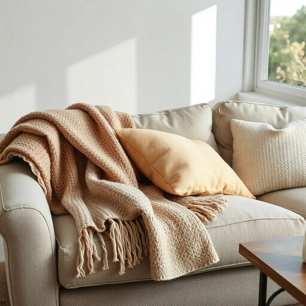
For sofas and sectionals, start with a relaxed fold. Drape the throw along the arm or over the back cushion, then smooth the front edge so it lies evenly. If you use multiple pillows, keep the throw as the anchor layer by ensuring its pattern scale is larger than the smallest pillow detail.
Accent chairs and reading nooks
Chairs benefit from a shorter, more visible drape. Use a partial fold so the texture appears clearly. Place it on the seat edge or along one side of the backrest. This creates an easy grab point and adds a touch of softness that contrasts with structured upholstery.
Bedrooms and bed styling
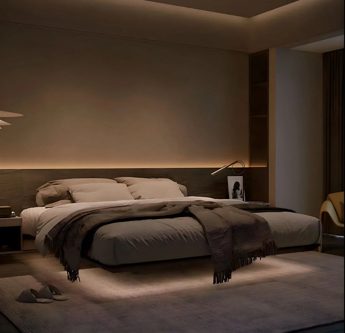
On beds, Decorative Throws work best when they reinforce the color story of bedding. Fold the throw in thirds, then place it lengthwise at the foot of the bed or casually across the top edge. For visual symmetry, align the folded edge with the pillow boundary.
Dining and entry areas
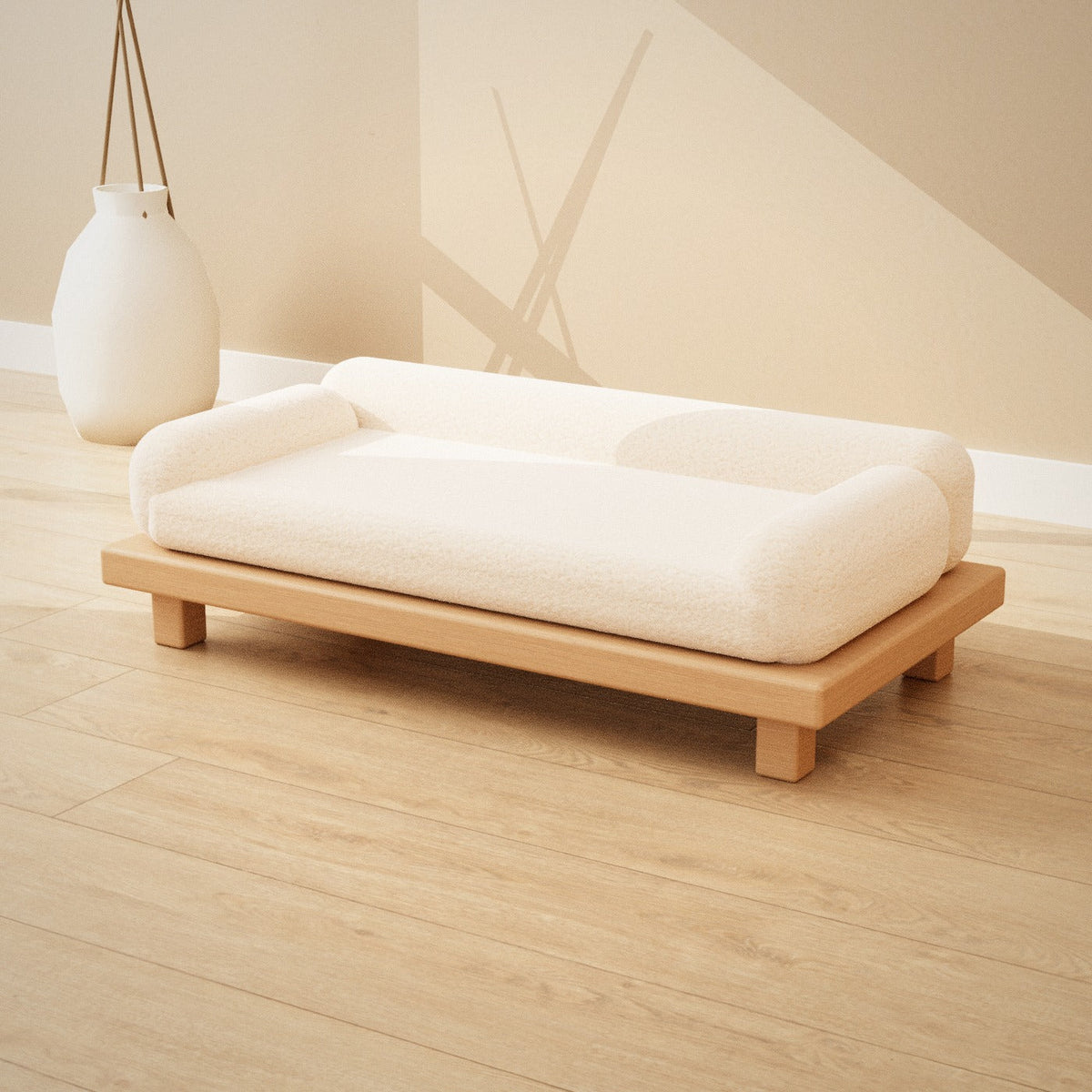
Throws are also effective on benches or accent stools, particularly in modern entry layouts. Keep the styling simple: one throw, clean edges, and a color that complements your floor tone or wall shade. In these spaces, moderation looks more intentional.

Room-style placements: chair, sofa arm, and bed foot
5. Color and Pattern Strategy
Color and pattern are where most Decorative Throws either blend seamlessly or stand out for the wrong reasons. A strong strategy is to choose an undertone first. Cool undertones pair best with gray, blue, and crisp whites. Warm undertones pair best with beige, cream, and earthy browns. If your space contains both, aim for a neutral throw that includes both undertone notes.
Pattern scale is the next decision. Small patterns can feel busy when paired with other prints. Large patterns can dominate if the rest of the room is already bold. A practical rule is to treat one element as the focal point. If cushions carry noticeable pattern, select a throw with subtle texture or a muted pattern. If the room is mostly solid-colored, you can introduce a bolder woven motif.
Also consider contrast value. Contrast is not only about light versus dark. It is about the visual brightness and depth of the fabric. A light throw in a very light room can appear flat, while a deep throw in a dark room can look heavy. Testing with the room’s dominant lighting helps. If your space receives strong natural light, mid-tones often read more balanced. If lighting is dimmer, slightly warmer or brighter throws can lift the overall feel.
For a confident approach, choose one of these safe combinations:
- Monochrome with texture: use a single color family but vary weave or knit density.
- Complementary accents: pick a throw color that echoes a smaller detail, such as a rug border or curtain edge.
- Neutral base with a statement edge: keep the main field calm, and let a patterned border provide interest.
6. Comparison: Texture, Use, and Maintenance
Below is an objective comparison to help you match fabric behavior to your needs. While every piece differs, these general tendencies guide better decision-making.
| Option | Best for | Visual effect | Maintenance considerations |
|---|---|---|---|
| Knitted throws | Cozy living rooms, casual styling | Soft depth and relaxed drape | May pill over time; gentle washing helps |
| Woven patterned designs | Structured spaces, layered beds | Clean lines and defined motifs | Usually retains shape; follow fabric care |
| Plush or brushed finishes | Comfort-forward seating | High softness and warmth cues | May show lint; brush and lint control help |
| Matte solid neutrals | Minimal interiors, color-focused rooms | Balanced calm with subtle texture | Less visually reactive to small stains |
If your furniture already has strong form, choose a throw that reduces visual tension. In rooms with bold seating lines, Decorative Throws with softer texture and neutral tones often deliver the most coherent look. If you want to elevate the style further, align the throw color with a consistent element such as wall paint tone or curtain shade.
For inspiration on room styling through furniture finishes, you may also consider pairing seating and accent pieces with complementary neutrals. For example, explore a chair that matches your tone palette at Izumi Chair or coordinate a cabinet base at Asuka Cabinet. These references can help you visualize how fabric textures sit beside wood and upholstery.
7. Summary & Recommendations
Decorative Throws succeed when they connect comfort to design intent. Select the correct size for the surface, choose a fabric that matches your daily handling, and use color and pattern with a clear focal strategy. Instead of chasing novelty, build a coherent palette that repeats in small ways across the room. When you do this, the throw looks natural in every season.
Recommendations to apply immediately:
- Measure your seating or bed area before buying to avoid scale issues.
- Pick one hero feature: texture, pattern, or color contrast. Support it with quieter elements.
- Choose mid-weight options if you want one throw to work across multiple rooms.
- Follow fabric care instructions to maintain softness and appearance.
If you want additional guidance on fabric and color coordination with interiors, use these principles as a checklist. It is a reliable method for creating a polished, lived-in look that remains relevant year after year.
8. Q&A
How do I choose the right size of Decorative Throws for my sofa?
Start by identifying the surface that will receive the throw. For a sofa, a throw should cover the top of the arm and fall slightly toward the seat without hanging too far. If you want a layered look, use a longer throw and drape it along the back cushions. If you prefer a minimal style, select a shorter throw that stays mostly on the arm or one side of the backrest.
What is the safest way to match a throw with existing cushions?
Match through tone and undertone rather than exact color. Choose a throw that shares at least one undertone with your cushion covers. Then vary texture so the layers feel intentional. If your cushions include patterns, select a throw with either a calmer pattern or a solid surface with visible weave detail.
How should I wash and maintain a throw to keep it looking new?
Always follow the care label. In general, gentle washing and avoiding harsh drying settings help reduce pilling and maintain softness. For woven or knitted surfaces, use mild detergent and separate dark and light tones. If you notice lint, use a fabric-safe brush or lint removal tool before washing, and store the throw in a clean, dry location when not in use.
Can one throw work for both decoration and daily comfort?
Yes. Select a mid-weight fabric with a comfortable hand feel and a pattern scale that does not quickly look dated. Place it where it is easy to pick up during daily use. When the throw remains accessible, you are more likely to use it, which improves both comfort and the consistency of the room’s style.
Where should I place a throw on a bed for the most balanced look?
Place the throw at the foot of the bed or across the top edge for an effortless, styled effect. For symmetry, align the folded edge with the pillow boundary. If you want an airy appearance, drape it with a slight bend rather than keeping it perfectly flat. The goal is to look natural while still maintaining clean lines.
How often should I rotate or reposition a throw?
Rotating the throw periodically helps reduce uneven wear and sun fading. A simple habit is to reposition it when you change bedding or refresh seasonal décor. Keeping the same placement too long can cause slight shading differences, especially in rooms with strong sunlight.
Does texture matter more than color in modern interiors?
Both matter, but texture often delivers a higher impact in modern spaces. When the room uses neutral colors and clean lines, texture provides the visual warmth that a smooth solid fabric cannot. Choose a texture that complements the room’s materials, such as wood, metal, or upholstered seating, and ensure it does not clash with existing weaves.
What should I avoid when styling Decorative Throws?
Avoid combining too many competing patterns at once. Also avoid selecting a throw that is drastically out of scale with your furniture. Finally, do not ignore undertone alignment. Even small undertone mismatches can create a visible dissonance that makes the room feel less cohesive.
Is it appropriate to use a throw in an entry or hallway?
Yes. A throw can soften the look of benches or seating at an entry point. Keep the styling simple, use a neutral tone that matches your interior palette, and ensure the throw can be cleaned easily. This approach maintains a tidy look while still adding comfort cues.
Can I style throws differently across seasons?
Yes. Swap or reorder placement to adapt to the season. Warmer textures and deeper tones can create a cozy effect in cooler months, while lighter tones and breathable weaves can refresh the look in warmer months. Maintain one consistent design rule, such as repeating an undertone, to keep the styling coherent throughout the year.
What is the fastest way to upgrade a room with a single addition?
Introduce a Decorative Throw with a distinct texture and a color that echoes your existing palette. Place it where it becomes a visual anchor, such as the sofa arm, chair back, or foot of the bed. This creates immediate depth and comfort cues without requiring major changes to your furnishings.
How can I tell whether my throw is too busy?
If the throw forces the eye to focus only on one area, it may be too busy. A practical check is to look at the room from a normal standing distance. If the room feels visually loud, reduce pattern complexity by choosing a calmer throw or a solid texture layer. Maintaining one focal element keeps the overall balance.
Are neutral throws always safe?
Neutral throws are generally versatile, but undertone matching still matters. A neutral that is too cool can look off next to warm wood finishes. Likewise, a warm neutral can appear yellow beside crisp whites. Choose neutral tones that align with the warmth level of your existing surfaces for a seamless result.
What is a reliable layering method when I have multiple fabrics?
Use a hierarchy: base layer for calm color, mid layer for texture, and top layer for pattern or accent detail. Keep the pattern scale balanced across layers. This structure helps the room feel deliberate and prevents the throw from appearing disconnected from the rest of the décor.
Should I prioritize durability or softness when choosing a throw?
Choose durability if the throw will be used frequently, especially in high-traffic seating areas. Choose softness if comfort is the primary goal and the throw is more decorative. A balanced mid-weight fabric with good material integrity typically provides both, which reduces replacement frequency.
How do I prevent a throw from slipping off furniture?
Use a placement fold that creates friction, such as draping the throw over the arm and smoothing the front edge. If the throw is very smooth, consider pairing it with a cushion cover or surface with a slightly textured finish. This simple adjustment can keep the throw in place while preserving the intended look.
Can a throw help tie together mismatched furniture?
Yes. A throw can act as a visual bridge when it repeats tones found across different pieces. Choose a color that appears in at least two furniture elements, such as upholstery and curtains, and select a texture that complements both. This strategy reduces visual contrast between unrelated pieces.
What is a practical approach for choosing between two throw options?
Select based on the dominant problem you want to solve. If the room feels flat, prioritize texture. If the room feels too busy, prioritize a solid tone. If you need comfort, prioritize fabric softness and mid-weight drape. Once you choose the primary goal, the rest of the decision becomes easier.
Do I need to match the throw color exactly to bedding?
Exact matching is not necessary. Coordinating through undertone and using shared color notes is more visually sophisticated. Aim for harmony rather than duplication. This approach allows your décor to feel flexible while still looking cohesive.
What is a good guideline for selecting the pattern density?
Balance pattern density with the room’s existing complexity. If your cushions and rugs already feature strong motifs, choose a throw with lower density or texture-led interest. If the room is mostly solid, a moderate pattern can provide depth without overwhelming the space.
About the Author
Nisu Home
Nisu Home specializes in interior styling strategy, textile selection, and practical home design guidance. With a focus on comfort-led aesthetics and long-term usability, Nisu Home helps readers choose pieces that look refined and feel right in daily life. Thank you for reading, and may your space feel warmer, calmer, and more intentional.
Disclaimer: This article provides general guidance on home décor and textile selection. Product care instructions and performance characteristics vary by material and manufacturer. Always follow the care label and product specifications for accurate handling.

Leave a comment
This site is protected by hCaptcha and the hCaptcha Privacy Policy and Terms of Service apply.